|
It is important that resources for students contain detailed subject content and great case studies, incorporate metalanguage and provide a range of student activities, but what a resource looks like will also impact on student engagement and usability. Powerful Geography has been designed to be visually attractive, uses colourful, clear diagrams and infographics, and has a plethora of newly designed illustrations and graphics that students won't have seen before. Included below is a collection of sample pages for you to see what the Powerful Geography resource looks like. Visualise This pages contain complex geographical information in colourful illustrations and graphics. The purpose of this is to make sure that complex information is accessible for the full range of students, including those who may find complex text and terminology difficult. They also provide a great opportunity for all students to explore geographical information represented in a variety of different forms, and to develop the skills to manipulate and interpret information in different ways. The sample below shows the layout of the Visualise This about The Anthropocene. 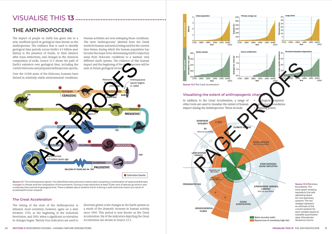 GEOstories have a similar layout to the longer case study chapters, with larger sections of text broken up by maps, diagrams and beautiful images. These are shorter case studies that can be used to explore themes in greater depth for students requiring extension (see our previous blog about Linked Content). Alternatively, a teacher may choose to use a smaller GEOstory in preference to a longer case study for students requiring learning and support. GEOstories are a form of chunking information at a larger scale. The excerpt below is from the GEOstory sample about the Wollemi Pine. 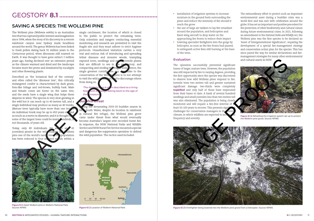 Throughout the larger case studies chapters, information has been chunked in manageable sections to allow students to absorb information without becoming overwhelmed. The layout has been designed to include white space and some larger images and maps to break up text. Colours have been chosen to address colour contrast and improve usability and readability of maps and graphics. The excerpt below is from the Case Study sample of the Lake Eyre Basin. 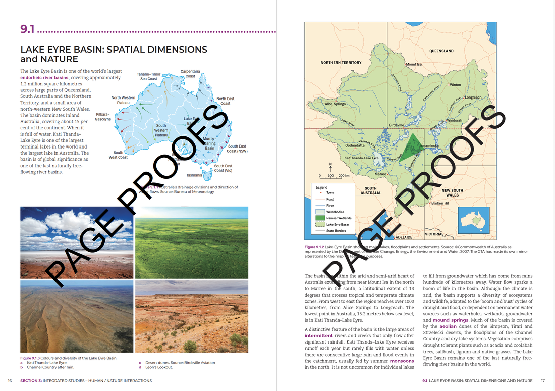
1 Comment
Elizabeth George
2/13/2024 07:20:38 pm
hi is the book published yet/ If so could you please tell me where I can purchase it Leave a Reply. |
AuthorsLorraine Chaffer Categories
All
Archives
June 2024
|
 RSS Feed
